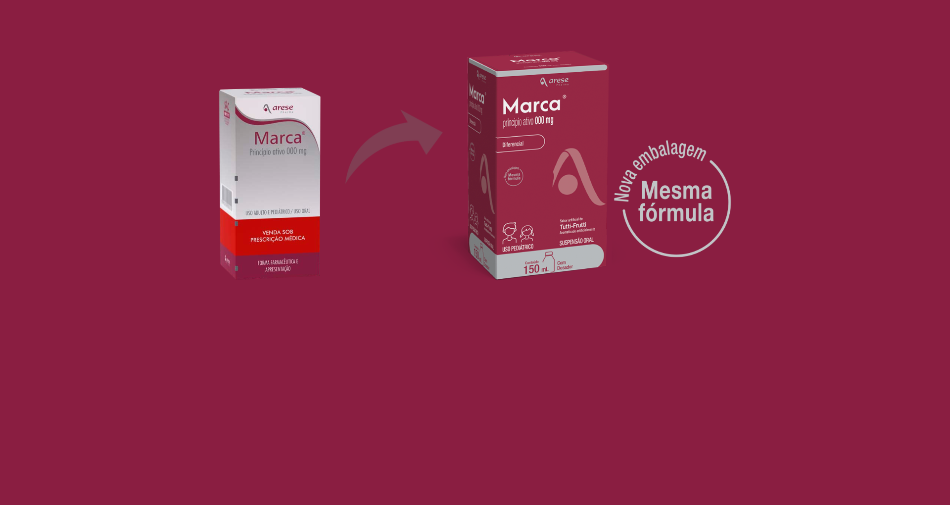
A new packaging for a new time!
With a new, cleaner design and more modern lines, our packaging has a brand new look.
With a new, cleaner design and more modern lines, our packaging also has a brand new look.
Our packaging has been developed to be even more practical and comfortable for patients and to be easily recognizable for doctors and at points of sale.
We adopted the Bordeaux color and our Logo became the protagonist, always being linked to our identity, which represents quality.
The chosen typography is also more modern, organized and brings clearly marked information.
The use of icons for Target grouping, Therapeutic indications and Presentation also mark the easy interpretation of the product, for whom it is intended and its presented formulation.
We updated our Nutrition facts label according to the new Anvisa standards and provided the leaflet via QR Code.
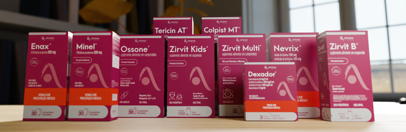
All upper flaps of the tablet boxes are now detachable, generating a product holder and adding organization to storage.
We also added one more front-face to the product, making it easier to identify in drugstores.
Learn more in our video on the new packaging: